
- MAIN
- ILLUSTRATOR
- EXPERIENCE
- WORK WITH ME
- PURCHASE ART
- 0
Grounded In Galicia
Relocation service and brand for your guide to life in Galicia, Spain.
Project Snapshot
- Year: 2025
- Role: (Creative Director, Art Director, Designer, Illustrator, etc.)
- Project Type: (Branding, Web Design, Campaign, Illustration, etc.)
- Deliverables: Primary logo and mark system; color and type system; brand nouns and tone of voice; relocation checklists and downloadable guides; modular website (home, services, checklist hub, resources, contact); SEO content plan; social templates and launch campaign assets; client onboarding kit and CMS templates.
Project Details
Select each to category to learn more.
The Challenge/Opportunity
- Context: Early materials were heartfelt and practical but inconsistent in tone and visual language, which limited discoverability and trust for prospective relocators.
- Core Problem: The brand lacked a unified identity and a content architecture that could scale: inconsistent logos and color usage, fragmented storytelling across documents, and no website optimized for search, conversions, or downloadable resources.
- Opportunity: Position Grounded In Galicia as the authoritative, human‑centered relocation concierge for Galicia by building a grounded visual identity and a content‑first website that converts curiosity into consultations. Turn lived experience into repeatable assets (checklists, guides, webinars) that both educate and capture leads.
- Constraints: Bilingual content needs (Spanish/Gallego/English), limited initial budget for paid acquisition, regulatory and immigration accuracy requirements, and the need to preserve founders’ authentic voice while professionalizing the brand.
- Success Criteria: A cohesive identity and website that: (1) increases qualified lead capture, (2) reduces time spent answering repetitive relocation questions via downloadable assets, and (3) positions the founders as trusted local experts.
Audience & Insights
Primary Audiences
- Remote professionals and digital nomads seeking lifestyle change
- Families relocating for quality of life and schooling options
- Retirees and property investors exploring Galicia
- Expat communities and returnees with cultural ties to Galicia
Key Insights
- Relocators value trust, clarity, and concierge support; they respond to practical, step‑by‑step resources.
- Emotional drivers (belonging, safety, lifestyle) are as important as logistical drivers (visas, banking, healthcare).
- Bite‑sized, downloadable checklists and clear process maps reduce friction and accelerate inquiry.
Behavioral Needs
- Fast access to credible, actionable steps (visa, NIE, healthcare).
- Templates and checklists they can share with partners or advisors.
- Local voice and proof points that reduce perceived risk.
Approach & Creative Direction
Strategic Framing We treated the brand as a bridge between emotion and logistics: the visual system needed to feel grounded and local while the content needed to be practical and trustworthy.
Narrative Architecture
- Core story: “Grounded In Galicia helps you move with confidence, practical concierge support rooted in local knowledge.”
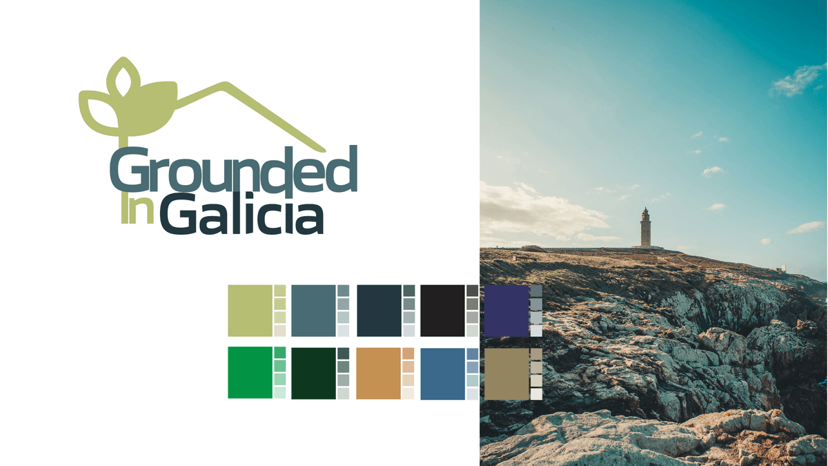
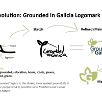
- Brand nouns: Earthtones, rooted, home, iconic greens, blended local knowledge. These informed imagery, copy, and UX tone.
Identity System
- Mark: A plant/house hybrid that reads as roots + shelter — used as primary mark, favicon, and section accents.
- Color palette: Warm earthtones and greens for trust and place; accent orange for calls to action.
- Typography: A humanist sans for UI clarity and a warm serif for long‑form storytelling to balance approachability with authority.
- Patterns: Subtle root/leaf textures used as section dividers and PDF backgrounds to reinforce place.
Content & UX
- Checklist Hub: Modular, downloadable 6‑month and 3‑month checklists (editable PDFs) that reduce repetitive email queries.
- Service Pages: Clear service tiers (concierge, legal referrals, school placement) with outcome‑focused copy and social proof.
- Resource SEO: Pillar pages (Visas, Healthcare, Housing, Schools) optimized for long‑tail queries and local search.
- Conversion Flow: Lead magnet (free checklist) → email nurture sequence → consultation booking; built into CMS with analytics.
Design Process
- Discovery interviews with founders to capture voice and lived experience.
- Rapid concept exploration (three identity directions) with annotated rationale.
- Prototype website wireframes, then high‑fidelity UI and responsive templates.
- Content sprints to convert checklist and relocation docs into SEO‑ready pages.
- Accessibility and mobile optimization checks for readability and download usability.
Collaboration & Governance
- Created a concise brand playbook and CMS editorial guide so founders and partners can publish consistent content.
- Built templated landing pages and social carousels for quick campaign launches.
Tools & Skills Used
- Design Tools: Adobe CC, Figma, CMS
- Practice Areas: Creative direction, brand strategy, art direction, storytelling
- Execution: UX/UI layout, prototyping, iconography, pattern systems
- Standards: Accessibility‑first design, documentation, AI‑assisted asset generation
Reflection
This project was a reminder that great brand work is both emotional and operational. Grounded In Galicia’s strength is its founders’ lived experience; our job was to translate that authenticity into systems that scale. If we had more runway, I’d develop a localized content series (video interviews with local partners), a motion language for microinteractions that visualize “rooting in” steps, and a community portal where recent relocators can share tips, turning the brand into a living ecosystem that supports every stage of the move.
- Context: Early materials were heartfelt and practical but inconsistent in tone and visual language, which limited discoverability and trust for prospective relocators.
Design & Execution (The Work)
Assests and Visuals


Jeff Bruzdzinski | Illustrator, Artist, and Designer
© 2026 All Rights Reserved | Contact | Work with Me | Purchase Art | Portfolio | Workshops